
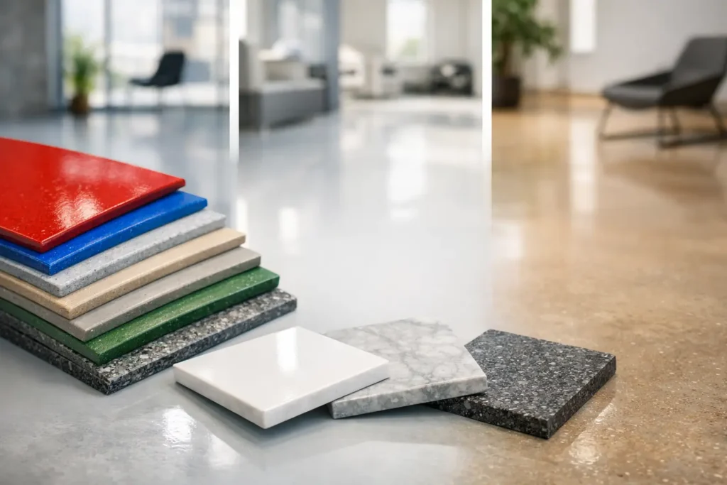
A resin floor is rarely remembered for its technical spec alone. What stays with people is the way the surface changes a room – how it catches light in a hallway, grounds a kitchen, sharpens a retail space or gives a garage a cleaner, more deliberate feel. That is why resin floor colour options matter so much. The right shade does more than look good on day one. It shapes atmosphere, influences maintenance expectations and helps a space feel properly resolved.
For some projects, the answer is immediate. A warm stone-toned floor in an open-plan kitchen may feel obviously right. In other spaces, colour takes more thought. Commercial interiors often need to balance brand image with practicality, while bathrooms and utility areas benefit from shades that feel calm but still forgiving in daily use. Resin gives far more scope than many people expect, but good choices come from understanding the room, the light and the finish as a whole.
How resin floor colour options affect the room
Colour in resin flooring is not just decorative. Because the finish is seamless and visually continuous, the chosen shade carries more weight than it might in a tiled or timber floor with joints, grain and pattern breaks. A pale resin floor can make a compact space feel broader and brighter. A darker one can add depth, drama and a stronger architectural edge.
The finish also changes how colour reads. Matt, satin and gloss each present the same tone differently. A soft grey in a matt finish may feel understated and contemporary, while the same grey in a higher-sheen system can look sharper and more reflective. Metallic and decorative epoxy effects introduce movement as well, which means the floor becomes less of a flat block of colour and more of a design feature.
This is where resin stands apart from more standard flooring choices. It is not simply a matter of picking from a narrow range of stock shades. A well-designed resin floor is part colour selection, part surface design.
The most popular resin floor colour options
Neutrals remain the starting point for many interior-led projects, and with good reason. Warm greys, greige tones, soft taupes and off-whites work beautifully in contemporary homes because they give space for cabinetry, furniture and lighting to do their job. They tend to age well stylistically and offer flexibility if the room is updated later.
Greys still have a strong place, but the best results now usually come from more nuanced versions rather than cold, flat shades. A grey with earthy warmth feels more refined in a kitchen or living area than something too stark. In commercial settings, medium greys also tend to perform well because they present a polished appearance while being more forgiving of everyday dust and marks.
Stone-inspired tones are another strong choice. Sand, clay, chalk and concrete-effect shades create a calm, architectural backdrop and sit comfortably within minimalist or natural-material schemes. These colours are especially effective where clients want the floor to feel premium but not attention-seeking.
At the bolder end, charcoal, deep green, navy and black can be striking. Used well, they create mood and definition, particularly in feature bathrooms, design-led retail spaces or entertaining areas. The trade-off is that very dark floors can show dust, streaks and lighter debris more readily, especially in areas with strong natural light. They can look exceptional, but they do ask a little more of maintenance and styling.
Then there are statement finishes. Metallic resin, terrazzo-inspired overlays and decorative blends introduce colour in a more expressive way. Rather than one solid shade, these surfaces can combine multiple tones, reflective particles or subtle marbling. They suit clients who want the floor to take a more active role in the design story.
Choosing colour for different rooms
A kitchen floor often benefits from balance. It needs to feel design-conscious, but it also has to live with spills, foot traffic and daily movement. Mid-toned neutrals usually work well here because they are versatile and practical. If the cabinetry is dark or heavily textured, a lighter floor can stop the room feeling weighted. If the kitchen is pale and minimal, a deeper resin tone can add contrast and structure.
Bathrooms can take a slightly different approach. Soft mineral shades, concrete effects and pale greys are popular because they create a clean, spa-like feel. In smaller bathrooms, lighter resin often helps the room feel more open. In larger ensuites or statement cloakrooms, richer colours can be used more confidently, especially when paired with warm lighting and strong fixtures.
Hallways need resilience, but they also set the tone for the rest of the property. A seamless resin floor in a warm neutral or sophisticated grey gives an immediate sense of order. This is one of the clearest examples of resin acting as both practical surface and design statement.
For garages, workshops and commercial units, colour choices are often more strategic. Mid to darker greys are common because they offer a crisp professional look without highlighting every tyre mark or trace of dust. Flake systems and decorative aggregates can be particularly useful in these environments because they disguise wear more effectively while still looking considered.
Retail and hospitality spaces often benefit from a more brand-led palette. Here, the question is not simply what looks attractive, but what reinforces the wider identity of the space. A resin floor can quietly support that identity through subtle tonal choices, or make a stronger visual impact through bespoke colour work.
Light, scale and the finish around it
A colour card never tells the full story. Natural light, artificial lighting, room size and surrounding materials all influence how resin flooring will actually appear once installed. A pale floor in a south-facing room may feel warm and luminous. The same shade in a darker north-facing space can appear cooler and flatter.
That is why sample-led decision making matters. Looking at colour next to wall finishes, joinery, worktops or furniture gives a far more useful picture than choosing in isolation. In premium interior projects, the most successful floors usually do not shout for attention on their own. They belong to a palette.
Scale matters too. In a small utility room, a bold colour can feel punchy and intentional. Across a large open-plan ground floor, that same tone may become visually dominant. The bigger the area, the more influential the floor becomes.
Practical trade-offs worth knowing
There is no single best colour, only the best fit for the way the space will be used. Very light resin floors can look fresh and elegant, but they may reveal dirt more easily in busy entrance areas. Very dark floors deliver drama, yet can show dust, pet hair and surface residue quickly. Highly reflective finishes can amplify light beautifully, though they may make imperfections or footprints more noticeable in some settings.
Patterned or decorative finishes can be more forgiving than plain single-colour surfaces, particularly in working environments. On the other hand, a simpler block tone may suit a quieter, more architectural interior.
This is where experience makes a difference. Good guidance is not about pushing the boldest option or the safest neutral. It is about reading the room properly – how it will be used, how it should feel and how much visual presence the floor ought to have.
When bespoke colour is the right move
Off-the-shelf shades suit many spaces perfectly well, but bespoke colour becomes especially valuable when a project is trying to achieve something more specific. That may mean matching a wider interior palette, complementing brand colours in a commercial unit or creating a floor with more individuality than standard greys and creams can offer.
Bespoke does not always mean louder. Often it means more refined. A carefully adjusted stone tone, a warmer industrial grey or a terrazzo-inspired mix with the right aggregate balance can elevate the entire scheme. This is where artistry and precision start to work together in a meaningful way.
For clients across Essex and London working on design-led homes or polished commercial interiors, that extra level of tailoring often proves to be the difference between a floor that simply fits and one that completes the space.
A smarter way to choose
If you are weighing up resin floor colour options, start with the room rather than the sample board. Think about light, traffic, adjoining finishes and the atmosphere you want to create. Ask whether the floor should quietly support the scheme or carry more of the visual impact. Then narrow the palette with practicality in mind.
The most successful resin floors are not chosen by trend alone. They are crafted to suit the architecture, the lifestyle and the ambitions of the space. When colour is handled well, resin stops feeling like a flooring product and starts reading as part of the design itself.
A good floor should still look right once the furniture is in, the room is lived in and the novelty has worn off. That is the real test of colour – not whether it stands out in a brochure, but whether it keeps making the space feel intentional every single day.