
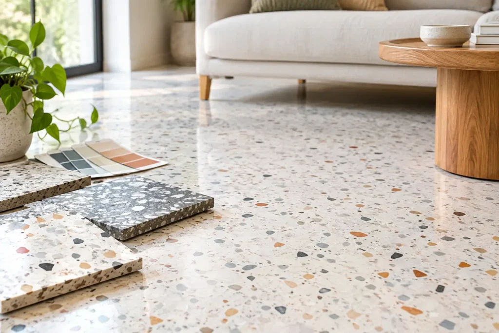
A terrazzo overlay should feel considered from the threshold, not simply decorative underfoot. This design guide for terrazzo overlays is for homeowners and commercial decision-makers who want the character of terrazzo with the clean continuity and tailored performance of a resin surface. The most successful schemes begin with how a room is used, how light moves through it and what the surface needs to say alongside the rest of the interior.
Unlike a pre-made tile, a terrazzo-inspired resin overlay is crafted in place. Its base tone, aggregate blend, density and final sheen can all be shaped around the architecture. That freedom is what makes it exciting, but it also means choices need to work together. A beautiful sample is only the starting point.
Start with the room, not the sample
A terrazzo overlay can bring calm to a busy family kitchen, a polished sense of arrival to a hallway or a distinctive identity to a retail or hospitality setting. Each calls for a different design response.
In a compact or low-light room, a lighter ground colour can lift the space and allow daylight to travel. Warm off-whites, pale stone, putty and soft grey are often more forgiving than bright white, which can feel stark against skirting, cabinetry and everyday life. Fine to medium aggregate provides visual interest without making the floor appear busy.
Larger, brighter rooms can accommodate more contrast. A deep charcoal or richly coloured base with a restrained aggregate blend can feel architectural and confident, particularly where walls and joinery are simple. In open-plan spaces, the overlay can become the element that quietly connects a kitchen, dining area and living zone without introducing grout lines or visual breaks.
For commercial interiors, think beyond durability alone. A reception floor, boutique retail unit or creative studio benefits from a finish that reflects the brand’s atmosphere. The same terrazzo language can be softened for a welcoming client space or sharpened with bolder chips and darker tones for a more expressive environment. Warehouses, garages and high-traffic back-of-house settings may require a more performance-led specification, so visual ambition should always be balanced with the demands of the site.
Design guide for terrazzo overlays: choose a colour story
The background colour does most of the visual work. It establishes the mood before the eye notices individual chips, so choose it in relation to fixed elements that are unlikely to change: kitchen fronts, brickwork, sanitaryware, timber, worktops and window frames.
A tonal scheme uses chips that sit close to the base colour. Think a warm grey field with ivory, sand and muted stone aggregate. The result is refined, forgiving and easy to live with. It suits contemporary homes that already have texture in timber, linen, plaster or natural stone, because the floor supports the scheme rather than competing with it.
A contrasting scheme has more graphic presence. Dark chips against a pale base, or pale chips set into a deep ground, create a more recognisable terrazzo look. This approach works especially well in entrance halls, bathrooms, bars and feature spaces where the floor is intended to make an impression. The trade-off is that high contrast draws attention to every surrounding decision. Keep cabinetry, wall colour and furnishings purposeful rather than overly busy.
Colour need not mean saturated tones everywhere. A single accent aggregate in rust, bottle green, cobalt or ochre can reference artwork, upholstery or signage without turning the surface into a novelty. It is often more enduring than a full-colour ground, particularly in rooms designed to evolve over time.
Before approving a palette, view samples in the actual room. Morning light, evening artificial light and the directional warmth of bulbs can alter a resin floor’s appearance considerably. In London and Essex properties, where Victorian proportions, new-build glazing and converted industrial spaces can sit within the same project brief, there is no substitute for assessing colour against the real architecture.
Match aggregate scale to viewing distance
Aggregate size changes the perceived scale of a room. Smaller chips read as texture from a standing height and suit understated interiors. Medium chips bring recognisable terrazzo character while remaining versatile. Larger fragments make a more artistic statement and are strongest in generous, open spaces where the floor can be viewed from a distance.
Density matters just as much. A sparse blend feels calm and contemporary, allowing the base colour to lead. A fuller blend gives the surface more movement and can disguise the small marks of daily use effectively. Neither is inherently better. A quiet bathroom may benefit from a delicate scatter, whereas a family kitchen or busy commercial floor can carry a denser composition with confidence.
Avoid choosing every chip colour independently. A well-crafted blend usually has a hierarchy: one dominant neutral, one or two supporting tones and, if desired, a measured accent. This gives the finish depth without visual noise. At Resinize, sample-led discussions are valuable precisely because proportion is as important as colour selection.
Plan the surface as part of the architecture
Terrazzo overlays look their best when they are treated as an architectural finish rather than a floor laid after every other decision. Consider where the surface begins and ends. Running it continuously through a hallway and cloakroom, or between a kitchen and utility room, can make a modest footprint feel more generous. In a bathroom, taking the same finish across the floor and selected wall areas can create a calm, enveloping effect.
Seamlessness does not mean ignoring transitions. Door thresholds, changes in substrate, drainage points and adjoining materials need careful planning. A neat detail where resin meets timber, tile or metal makes the scheme feel intentional. In wet rooms and commercial kitchens, slip resistance, falls and drainage must guide the specification before aesthetic choices are finalised.
Think about vertical planes too. Terrazzo-inspired resin is not limited to floors. A matching or complementary wall finish behind a reception desk, within a shower area or around a bar can bring cohesion without relying on repeated tiles. Used sparingly, it becomes a signature moment. Used across every surface, it can overwhelm, so allow quieter materials room to breathe.
Choose the right level of sheen
The final sheen shapes how the floor behaves in light and how much attention it attracts. A matt or satin finish feels soft, modern and composed. It works well in homes where daylight is strong or where the surrounding palette is natural and tactile. It is also a considered choice for spaces where glare needs to be reduced.
A glossier finish amplifies depth and can make aggregate appear more vivid. It can be striking in showpiece settings, retail environments and dramatic entrance spaces. However, stronger reflection can reveal dust, footprints and surface irregularities more readily. This is not a reason to avoid it, but it is a reason to select it honestly according to the space and maintenance expectations.
There is also a practical conversation around grip. Bathrooms, kitchens, entrances and commercial areas exposed to moisture may need a finish designed with slip resistance in mind. The right solution depends on use, cleaning methods and the level of exposure to water. A premium surface should never ask occupants to choose between design quality and sensible performance.
Respect the existing substrate
An overlay is only as considered as the surface beneath it. Resin systems can be installed over suitable existing substrates, which can be a compelling alternative to removing and replacing a complete floor. Yet suitability is never automatic. Moisture, cracks, movement, contamination, level differences and previous finishes all need assessment.
This is where a professional survey earns its place. Minor imperfections can often be prepared and corrected, but an unstable substrate cannot be hidden by a beautiful aggregate blend. In refurbishment projects, the practical advantages of an overlay – reduced disruption, less waste and the ability to transform a tired base – must be weighed against the preparation work required to achieve a lasting result.
Underfloor heating is another early conversation. It can work well with resin finishes when the system, substrate and curing process are properly considered. The key is coordination: heating, cabinetry installation and other trades should be planned around the floor rather than treating it as the final layer in isolation.
Let samples make the decision easier
Digital inspiration is useful, but terrazzo is tactile. Its character comes from the relationship between chips, resin, light and scale. Ask to see sample boards beside cabinet doors, paint swatches, tile selections and timber finishes. Put them on the floor, not only against a wall, and look at them at different times of day.
A sample should answer practical questions as well as aesthetic ones. Does the base tone feel too cool beside oak? Is the accent colour still appealing when viewed across a whole room? Does a dense blend make a narrow corridor feel energetic or cramped? These are small decisions before installation and expensive compromises afterwards.
The best terrazzo overlay does not chase a passing trend or imitate another project exactly. It gives a space its own visual rhythm, combining artistry with a finish made for real life. When colour, aggregate, sheen and preparation are considered as one composition, the result is more than a new floor: it is a surface that makes the whole room feel deliberately designed.